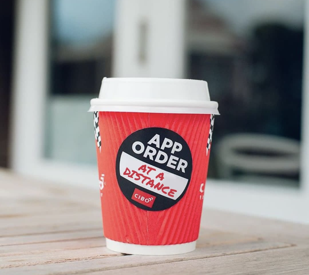
Cibo Espresso is Retail Zoo’s South Australian, Italian inspired, coffee franchise. The original Cibo app launched in 2016 using a Cordova framework based on the skillset in-house at the time. There were a few limitations with the frameworks so it was decided to redevelop the app to bring it onto a more modern platform (REACTNative).
APP OBJECTIVES
Re-platform the app
Analyse and redesign the flow of the app to account for repetitive purchase behaviour
Allow for product customisation of milks and extras and improve ATV in the process
Add Cibo’s food menu on to the app to give customers the full product offering
Redesign the app styles and colours with new accessibility friendly variations of the
brands pastel colours that adhere to colour contrast standards.Highlight the Cibo loyalty benefits and membership program to show value in the app
USER GROUPS
First Time App Users
It is important not to forget our untapped audience and who we would like to be reaching in the future. This group focuses on creating the best onboarding experience to convert new users to ongoing Cibo customers.
Coffee Convenience
Our Coffee Convenience customers are our primary app users. They preference convenience, consistency and on the go coffee experiences.
Casual Connoisseurs
The Casual Connoisseurs user preference experience over convenience. Their focus is on ambiance and taking the time to enjoy their coffee in good company. This customer group focuses more on dine in than takeaway.
Cibo Franchisee Partners
Although we are designing for customers, the partners are an intergral part, thus we must design with their needs and concerns in mind.
ANALYSING CUSTOMER REVIEWS (Motivations & FRUSTRATIONS)
USER JOURNEY - FIRST PURCHASE (FIRST TIME USER)
USER JOURNEY - ORDER AGAIN (COFFEE CONVENIENCE)
STYLE GUIDE
Here I used the existing brand colours for primary use of buttons and icons but created alternate versions for accessible text styles that adhere to colour contrast standards.


