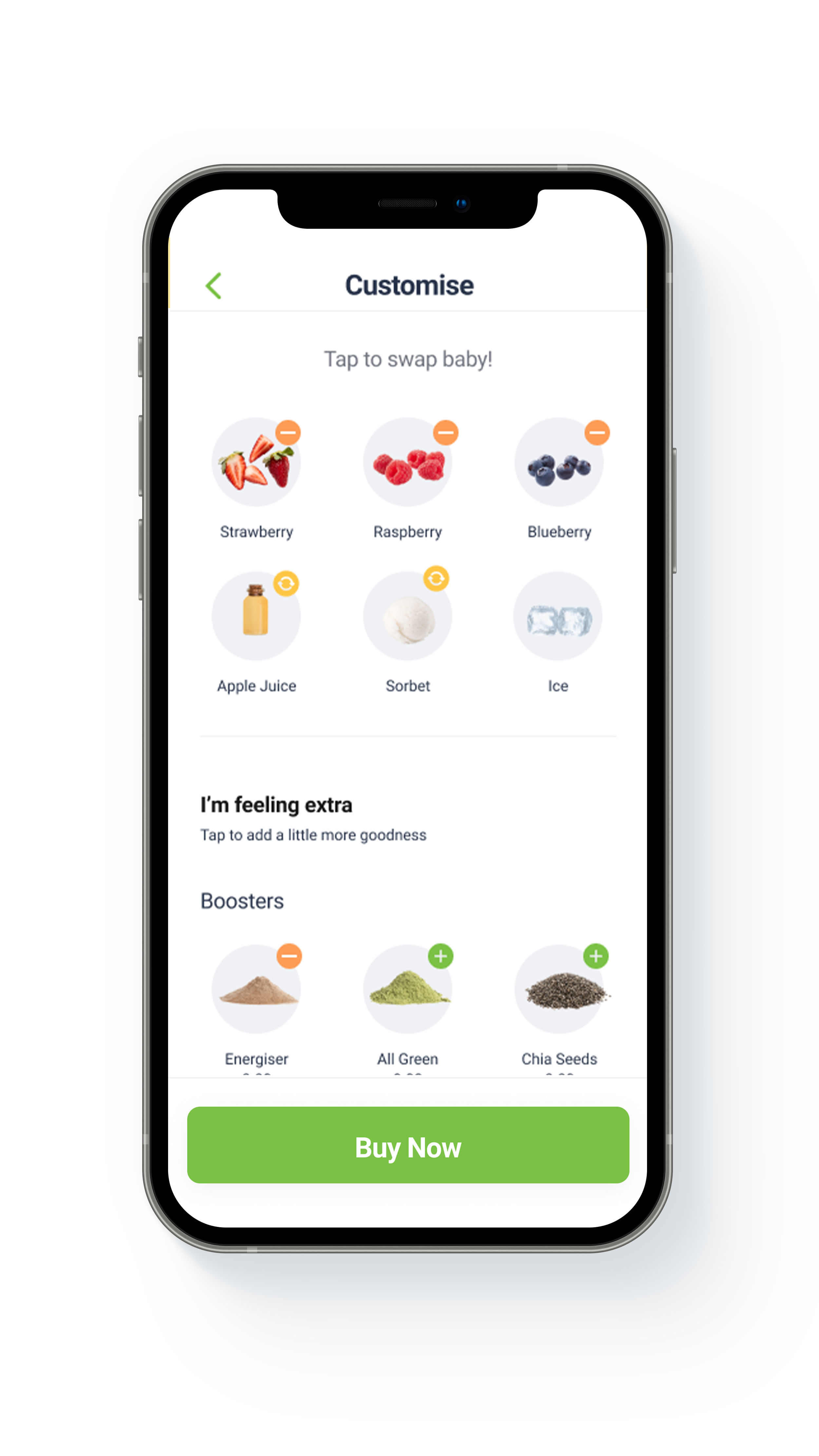
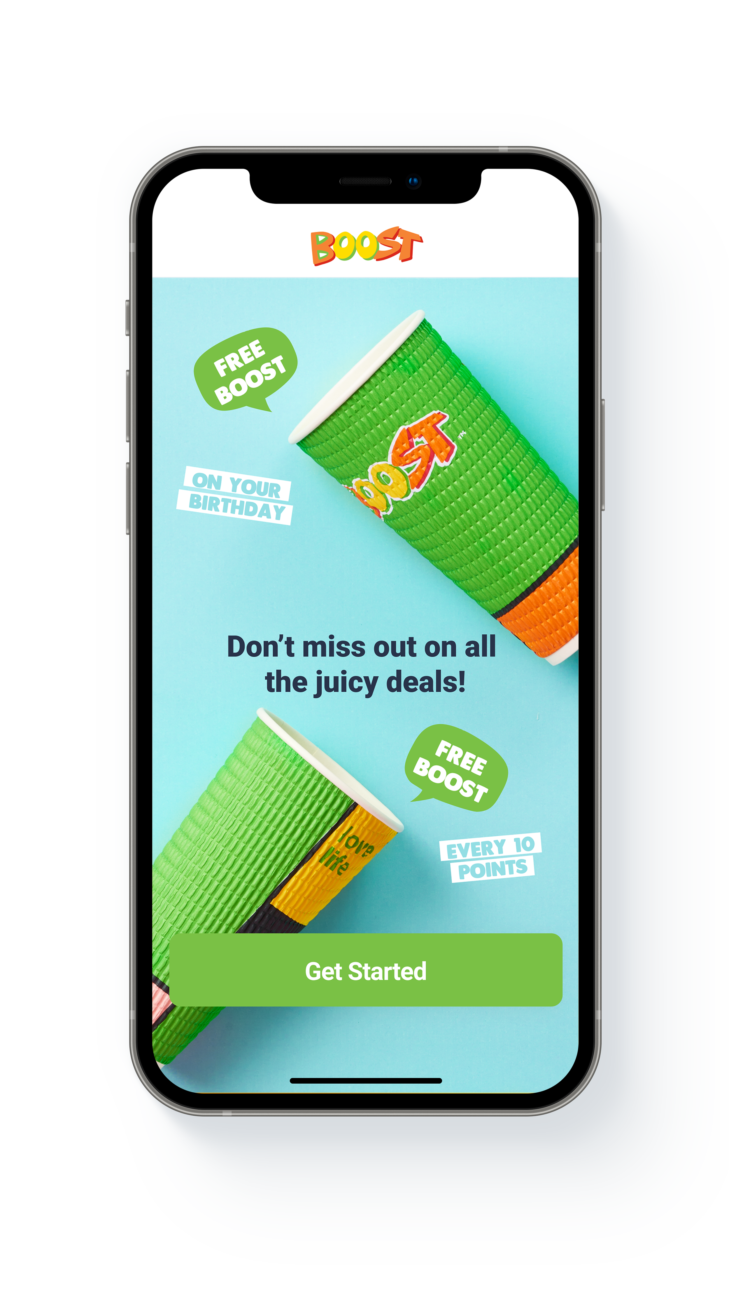
Boost launched the original app using a Cordova framework based on the skillset in-house at the time. Since, there were many limitations with the frameworks used to develop the back end technology, not to mention user experience problems so it was decided to redevelop the app into REACTNative.
APP OBJECTIVES
• Re-platform Boost’s backend infrastructure
• Analyse and redesign the flow of the app to add value, increase purchase behaviour
in the app and better the users overall experience
• Redesign the app styles and colours into more recent branding and adhere to
accessibility colour contrast standards.
• Personalise the experience through the use of content cards in Braze.
• Create an engaging experience through cheeky copywriting and challenges
within the existing loyalty program
BUSINESS GOALS
• Increase total percentage of sales in app from 3% to 4%
• Convert existing app customer behaviour from scanning in-store to purchasing in app.
• Convenience of ordering on the run and avoid queues due to popularity
• Platform to test and trial new products
• Increase ATV in the app from $8.43 to $9.40
• Increase Monthly Active Users from 220K (av) to 260K (av) over 12month period
COMMERCE:
Build an easy to purchase flow for our customers both new and returning. This should also take into account flexibility in the drink construct.
LOYALTY:
Provide an easy to earn and redeem journey that doesn’t detract from the primary goal of commerce.
ENGAGEMENT:
Keep our customers coming back time and time again to engage with us via the app.
USER EXPERIENCE RESEARCH (TOP-LINE)
As you can see from the below map, the original app did not have one clear purchase journey. Instead what we noticed was that customers were using the app as a digital vibe card to scan in-store.
The current scan feature pre-homepage has created a journey where 6% of our total users don’t reach the homepage.
Half of the app users that reach the Vibe scan, quit the app directly after.
The size and positioning of various features on the homepage are not representative of how our users are interacting.
USER GROUPS
Future App User
Existing or non-existing customers that purchase in-store but are not yet members of the app. This persona forms our untapped audience and anyone coming to the app for the first time.
App Scanner
Existing member who uses the app as a digital loyalty card. These users have various reservations to using the app for purchase but enjoy the benefits of the Vibe program. This group forms the majority of current app users.
App Member
Existing member who purchases sometimes in-store and sometimes via the app. These customers only purchase via the app when there is a monetary incentive particularly on our old Cheeky Tuesdays or Sip n’ Save days.
Loyal App Member
Existing member who purchases only through the app. These customers are familiar with all the benefits of Vibe and love to have a go at one of our Challenges for a cheeky discount.
PERSONAS
Sarah is now at uni but has been a Boost customers since she was 14. Since starting her degree at Monash University; between classes she likes to grab her old favourite, Strawberry Squeeze. Since Sarah has been purchasing more frequently she has found her old physical Vibe card.
Lynda is a mum of two and loves to treat her kids once a month to a Boost after school. Lynda has the app but always orders at POS. She likes the in person experience with the Boostie and is afraid to add her card details in the app. Lyndal uses the app to keep track of her points and to scan her digital Vibe card.
Maddy loves Boost and purchases about twice a month on her way home from school with her friends. Every now and then Maddy gets a push notification to notify her of a Sip n’ Save day. Maddy would usually order up at POS but doesn’t mind to try one of Boosts new flavours in the app if it means she gets it at a cheaper price.
Zoe works on the weekends at Chadstone Shopping centre. On her breaks she isn’t always hungry but loves to grab herself a Boost. She often gets her drinks at a discount as she keeps up with our social channels and is an avid challenge player.
REQUIREMENTS SESSION
Wireframe concept EXAMPLES
STYLE GUIDE
Here I used the existing brand colours for primary use of buttons and icons but created alternate versions for accessible text styles that adhere to colour contrast standards.
PRIMARY COLOURS
TEXT COLOURS
FONTS
SECONDARY COLOURS
BUTTON COLOURS
BUTTON TEXT
USER INTERFACE - SCREEN DESIGNS
COPYWRITING
Boost is such a cheeky, sassy brand and that came into play in the design. I collaborated on the copywriting for this project with the Social Media Manager and together we were able to step outside the usual error messages and empty state screens to add the element of humour and pop culture to the design.
CONTENT MANAGEMENT PLATFORM
The secondary part of the product requirements was to build a platform where marketing can manage the apps content. This included anything and everything from managing online stores, switching products on and off, recipe/ ingredient management, updating pricing and kilojules, LTO (Limited Edition Offers) content, campaign specials, additional news feed tiles, home tiles, product categories, content cards etc.
I worked with the development team briefly here to make sure the Laravel project was user friendly and would fit the needs of the marketing requirements. This is an example of how marketing can now set up a new campaign and the level of detail we went into adding dates, LTO products, special content cards and links as well as challenges and the rest of it.


